Brand Concept / Positioning
Two languages of the same downtime
La Costa fresca · with Larnilane
01 / Tension
The beer category sells an occasion: company, sport, noise. Inside that code there is no way to speak about a person’s state.
02 / Shift
From a reason to drink to a state a person makes for themselves. Two languages of the same downtime: inner balance and retro-resort lightness.
Concept and experience
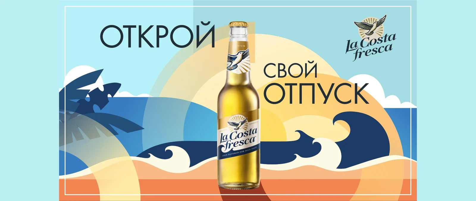
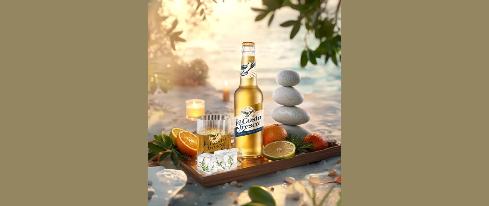
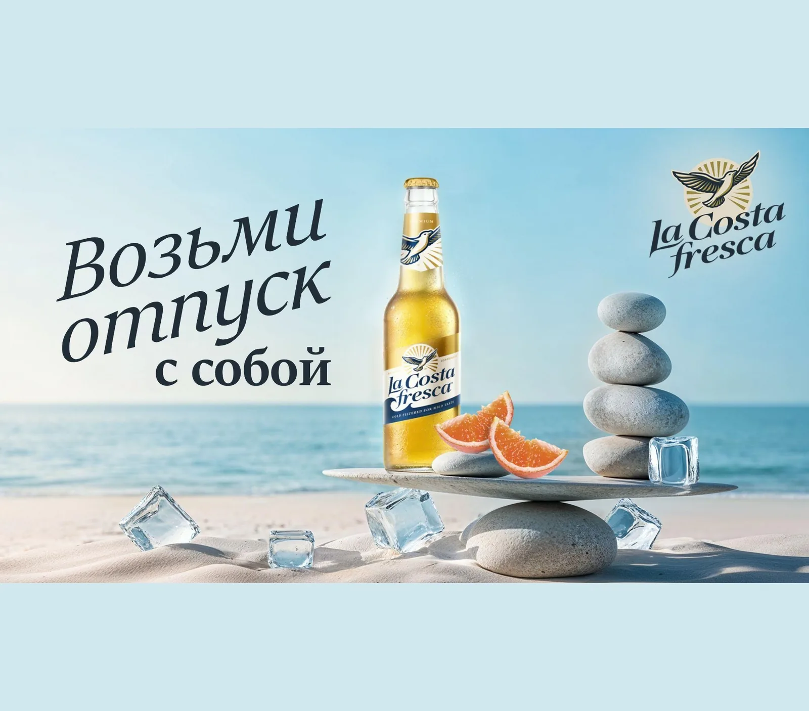
Each territory is taken to a complete system: naming, key visual, a signature ritual of drinking, gifting. “Balance” is built around stones and ice and the ritual of a deliberate pause; “Resort” around retro aesthetics and a ritual with citrus zest and sea salt.
Key decisions
- Develop both directions to comparable depth instead of picking one at brief stage
- Build the difference through the ritual of drinking, not only the advertising image
- Leave the standard beer codes in favour of personal, sensory experience
- Take each territory down to an operational level — a concrete mechanic of serving
Our role: developing both concepts in full — from the insight to the gifting.